The wall behind your front desk is often the first thing a visitor looks at. A logo in channel letters there tells people they’re in the right place and makes the room feel finished.
This guide collects ideas for planning that wall: layout, light, surface and size. For which lighting style suits an office in general, see Channel letters for offices and lobbies, or browse channel letters for your type of business.
Start from where people stand
Indoors, you know exactly where people will be when they see the sign: at the entrance door, in the waiting chairs, at the elevator doors, or looking in through a glass front. Stand in each spot and look at the wall.
Note what gets in the way — the desk, a monitor, a tall plant, people standing at the counter — and keep the sign clear of it. If many people pass at an angle, as in a hallway, simple, solid letter shapes hold up better than a thin script.
Layout ideas
How you arrange the logo depends on the shape of the wall.
| Layout | Works well when |
|---|---|
| Name centered above the desk | The desk sits in the middle of the wall |
| Symbol beside the name | The wall is wide and not very tall, such as above a long counter |
| Symbol above the name | The wall is tall and narrow, such as a column or the wall beside the elevators |
| Symbol on its own | Visitors already know your mark, and your name appears elsewhere in the room |
| Off-center | A door, window or panel edge sits on one side, and the sign lines up with it |
While you sketch:
- Center on the wall or on the desk? If the desk isn’t in the middle of the wall, pick one and line the sign up with it. Centered on neither looks like a mistake.
- Height. Measure from the floor to the top of the desk, and to the ceiling, a soffit or the lowest light fixture. The sign fits between them and clears anyone standing at the counter.
- Bare wall around it. Open wall on every side makes a logo look deliberate. Our size guide uses the United States Sign Council (USSC) rule of thumb: letters and the gaps between them should cover no more than about 40% of the background.
- Taglines. A tagline has to be much smaller than the name, so it’s harder to read. It often works better on your website.
How big? Indoors, the wall usually decides
Our size guide recommends about 1 in of letter height for every 10 ft of viewing distance. Indoors, that gives small numbers: from a door 30 ft away, 3 in letters already read at a glance.
So in most lobbies, the wall limits the size, not the reading distance. Size the main logo to sit comfortably on the wall, then check the smaller parts, like a tagline, against the distance from the door.
Choosing light for the room
Indoor light is steady, so the glow of the letters shows all day. What matters is the light already in the room and the surfaces around the sign.
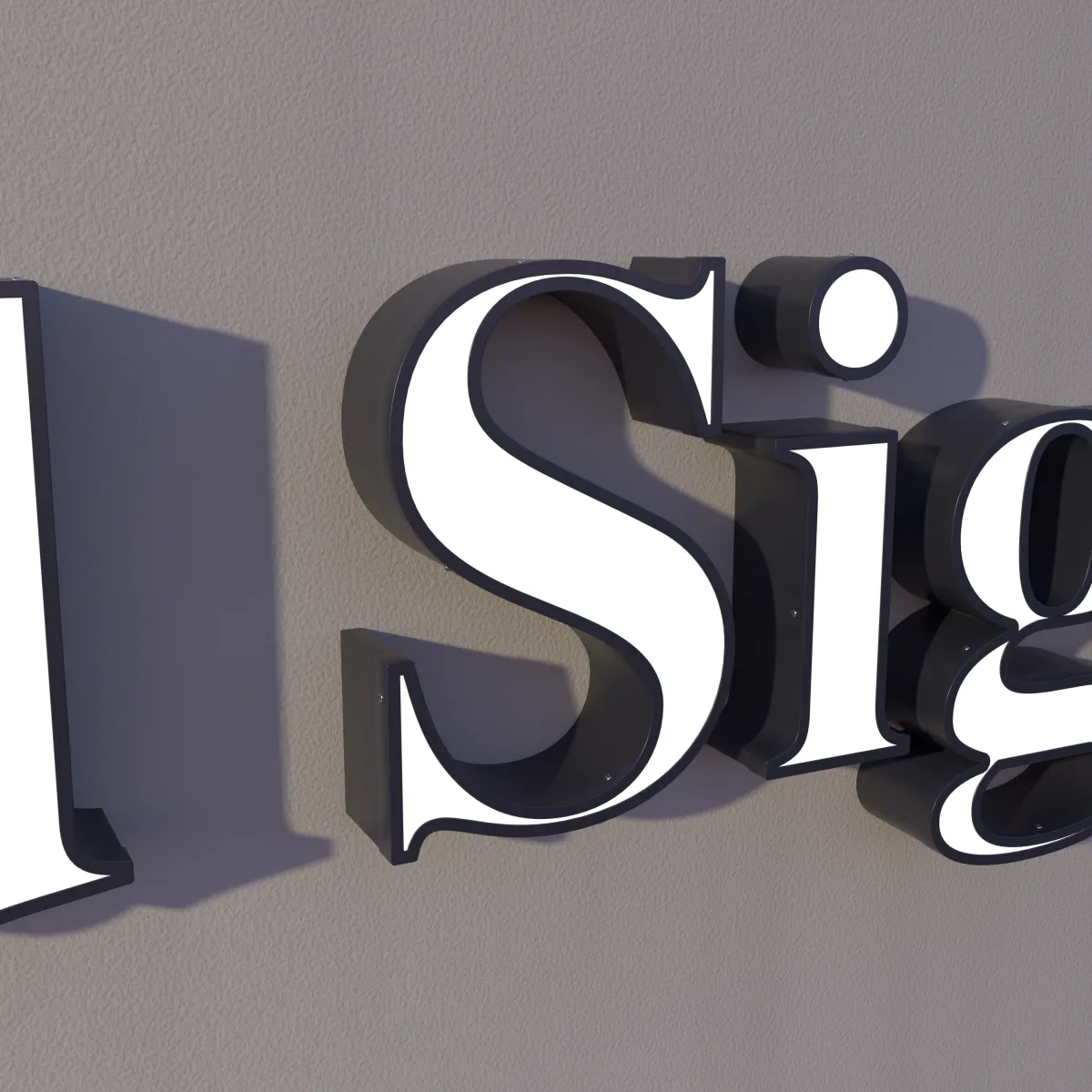
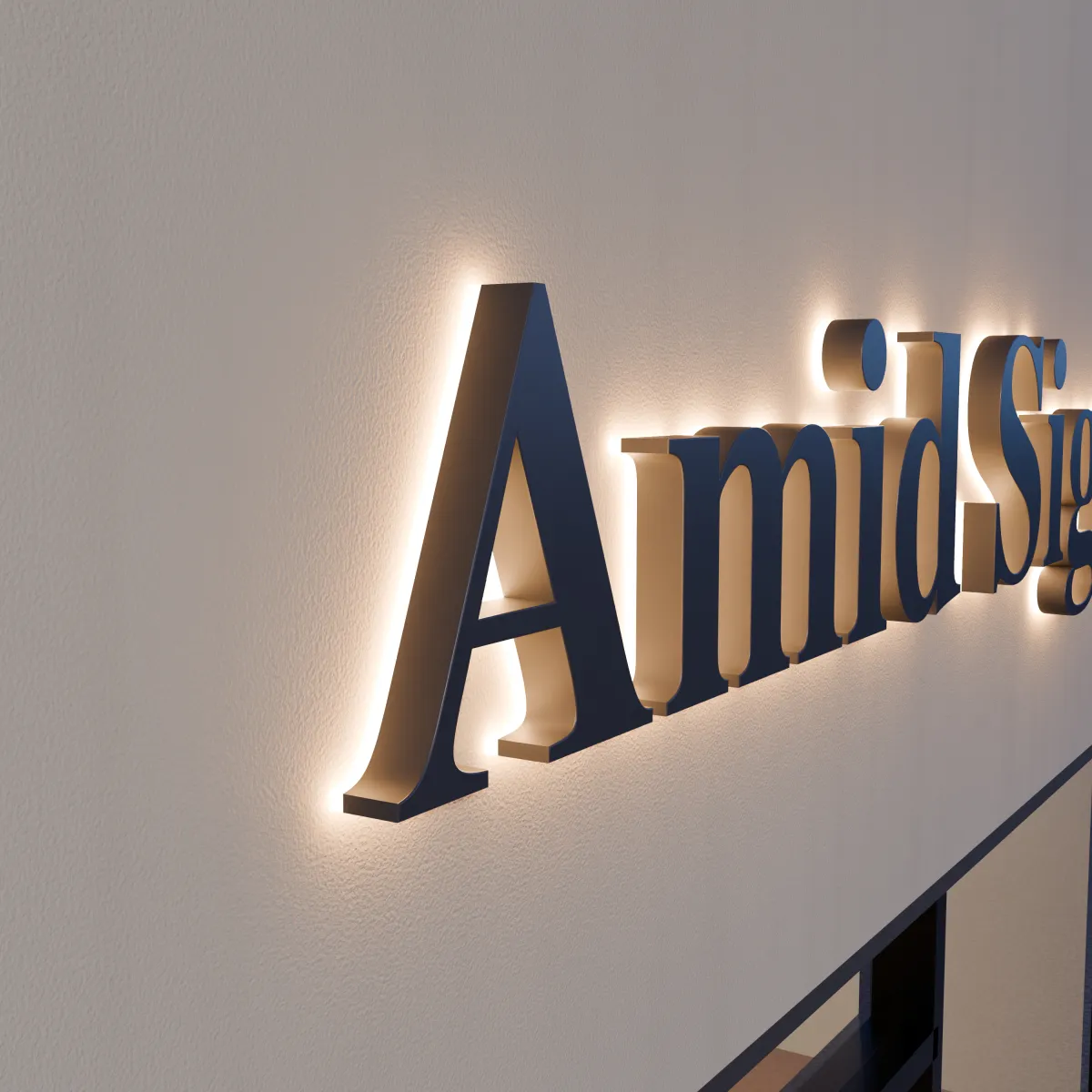
- Halo-lit: solid steel faces printed with your artwork, with light glowing on the wall behind. Soft, and best on a light, smooth, matte wall.
- Front-lit: acrylic faces glow inside the stainless returns. Brighter — a fit for a very large space, or a sign that must also read from outside through glass.
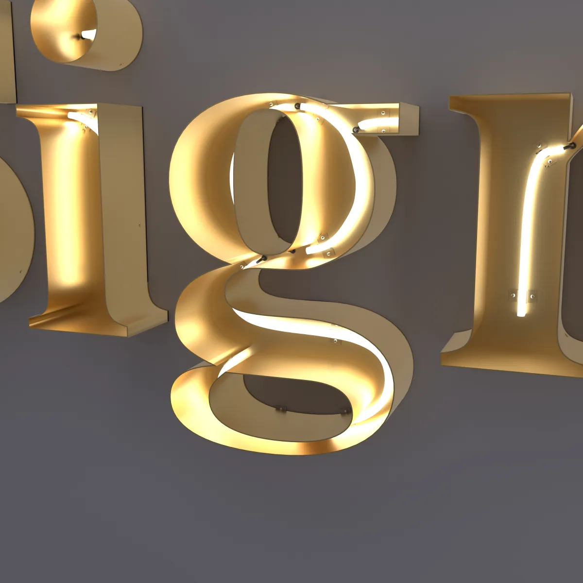
- Open-face neon: a visible LED neon line inside each open steel channel. Suits a creative studio, a break room or a photo wall.
All three are compared in Channel letters: the complete guide.
Two more checks:
- Ceiling lights. A downlight right above the wall throws bright patches that can compete with a halo. Mention any fixtures near the sign in your notes.
- Shiny surfaces. A glossy wall, a polished floor or a glass partition can reflect the lit letters — sometimes a nice effect, sometimes a doubled sign. A photo of the room helps us spot it.
The light color can follow the room’s lighting, warmer or cooler; we choose it with you, and it is shown on your drawing. If the sign faces a waiting area, ask us about brightness when you request a quote.
The mounting surface
Every letter mounts flush to the wall, with a paper template to mark the holes. Lobby walls vary more than storefronts, so tell us what yours is. The mounting hardware is listed on your drawing.
- Painted drywall. The most common. What’s behind it, studs or open space, decides the fixings.
- Wood slats or ribbed panels. Flush letters need a flat surface. Send a close-up photo so we can see the spacing.
- Stone or tile. Needs the right drill bit; plan holes around joints and grout lines.
- Glass walls. Ask first: people on the other side would see the back of every letter.
Power comes through the wall behind the sign, and the power supply is listed on your drawing. If the wall is new or being renovated, plan the power before it’s closed up, and have a licensed electrician make the power connection. More in Power supplies for LED channel letters and How flush-mounted channel letters are installed.
What to send
On the quote form, choose Indoor and include:
- Your logo file — see How to prepare your logo file
- Your brand colors — see How to match channel letters to your brand colors
- The wall width, and a straight-on photo of the wall with the desk in it — see How to measure your wall
- In the notes: the distance from the entrance, the wall surface, where power is, and which parts of the logo go up
- A lighting style, or “Not sure yet”
We reply with a drawing of your logo on your wall with every size marked, a lit preview and an exact price; pricing explains what sets it. Nothing is made until you approve the drawing.