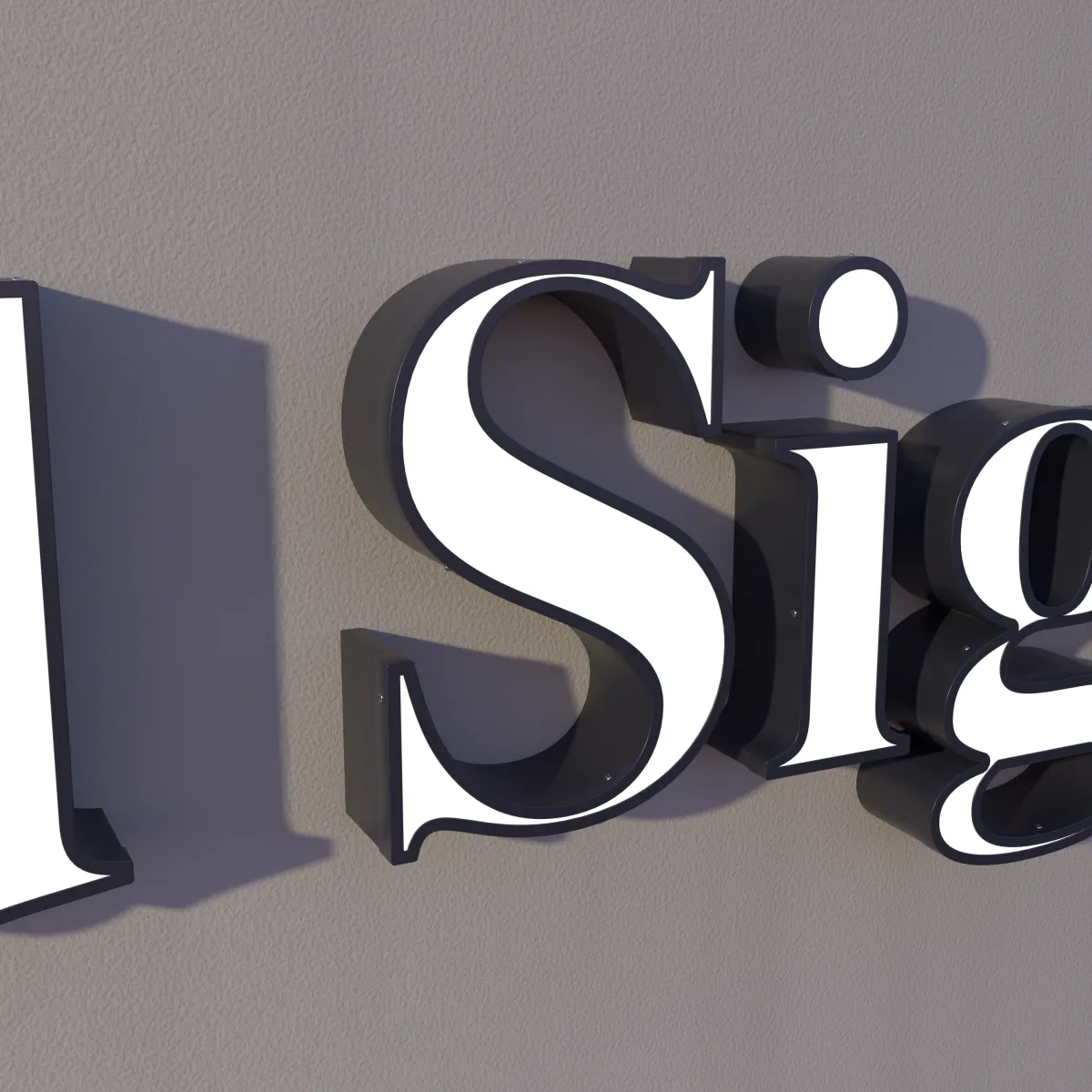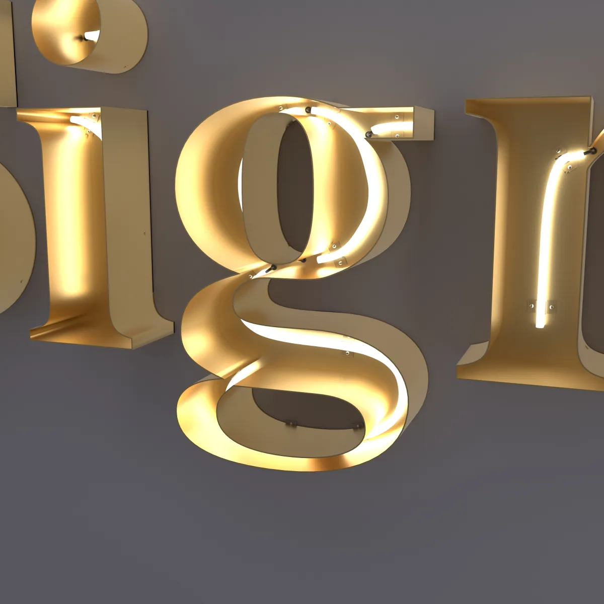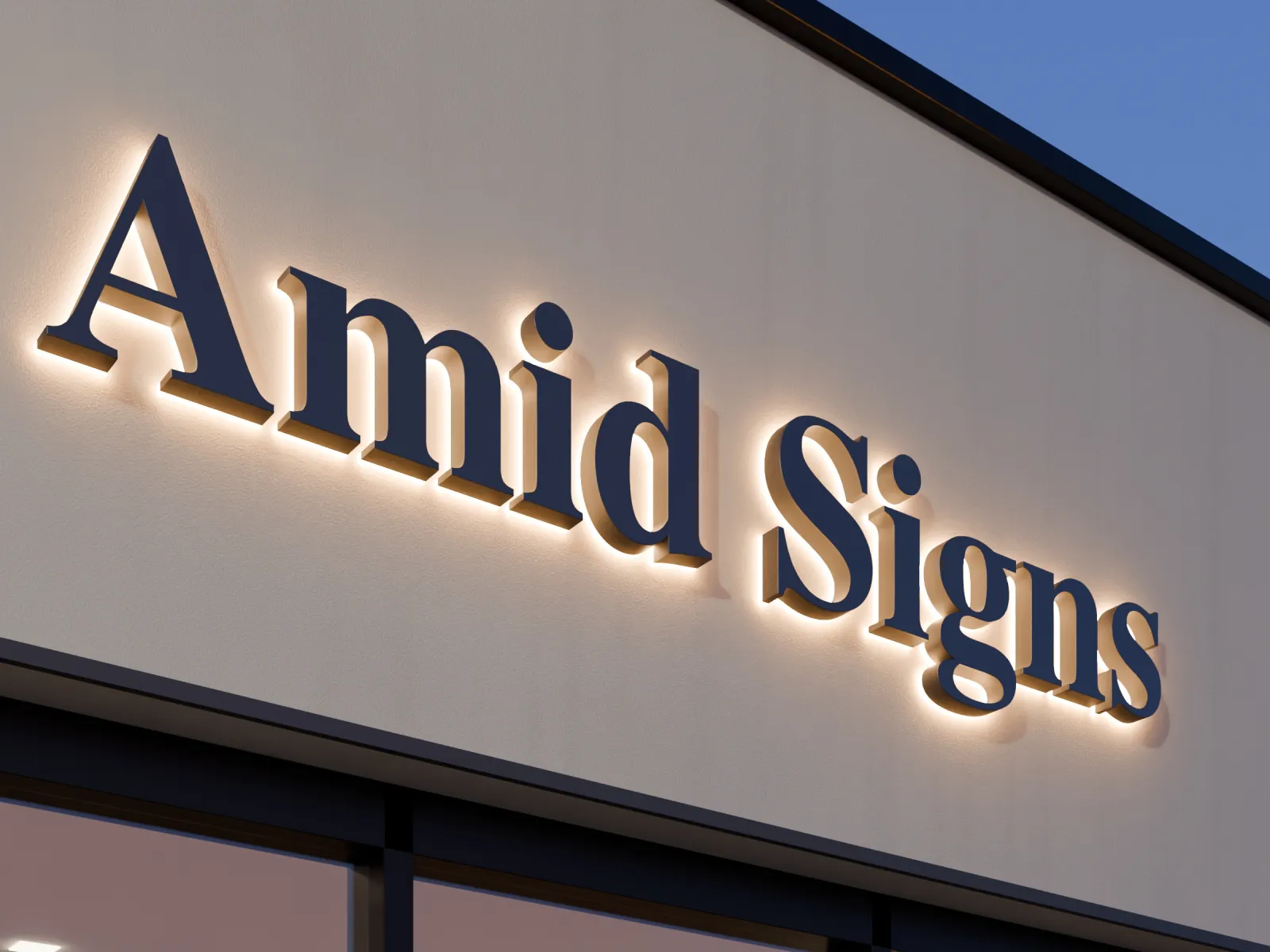
The color of a channel letter comes from three places: the steel (its finish), the face, and the light. Which of these you choose depends on the lighting style — and the wall behind the sign matters as much as any of them.
This guide explains each part, so you can pick colors that look right by day and at night.
Where the color comes from, by style
| Part | Front-lit | Halo-lit | Open-face neon |
|---|---|---|---|
| Face | Acrylic, in the color on your drawing | Solid steel, printed with your artwork | Open — no face |
| Sides (returns) | 304 stainless steel, finish chosen with you | 304 stainless steel, finish chosen with you | 304 stainless steel, finish chosen with you |
| The light you see | Through the face | A glow on the wall | The LED neon line |
Steel finishes
Stainless steel can be finished in different ways, and each one changes how the letter looks and how it wears. In general:
- Brushed (satin). Fine lines run in one direction and give a soft sheen. The lines help hide fingerprints and small scratches.
- Mirror (polished). Smooth and highly reflective. It looks striking, but it shows smudges and fingerprints more easily, and it takes on the colors of whatever it reflects — sky, street or the wall across the room.
- Colored metal finishes. A gold tone, for example, gives the look of a different metal on a stainless letter.
- Painted. A solid color, such as one of your brand colors or a shade that matches the wall.
We go over the finish for your style with you, and you see it on your drawing before you pay.
Front-lit faces
On front-lit letters the face is acrylic that lets the light through, so the face color is the color people see glowing at night. We choose it with you, and it is shown on your drawing.
- Light faces glow brighter. Darker colors let less light through, so they look dimmer at night.
- Day and night look different. By day you see the acrylic in daylight; at night you see it lit from inside. The same color can look quite different in daylight than when it’s lit. Check the lit preview on your drawing.
- The sides frame the face. A dark return around a light face gives a crisp outline. A return that matches the face makes the letter look like one solid shape.
Halo-lit faces
On halo-lit letters the face is solid steel printed with your artwork, so it can carry your logo colors. By day the letters look like solid colored metal. At night the faces stay dark and the glow outlines each letter on the wall.
That makes the wall part of the design:
- A light, smooth, matte wall shows the glow best.
- A dark, glossy wall absorbs the light and can reflect the LEDs like a mirror.
- Pick a face color that contrasts with the wall, so the letters read in daylight too.
Open-face neon
Open-face neon letters have no face. By day you see the steel channel and its finish; at night you see the LED neon line inside each stroke. Choose the steel finish and the neon color together, since one carries the daytime look and the other the night look.
Contrast is what makes a sign readable
Whatever the style, the letters have to stand out from the wall:
- Dark letters on a light wall, or light letters on a dark wall.
- Avoid letters and walls of a similar shade; they blend together in daylight, even if the sign glows at night.
- Look at the whole storefront: awnings, window graphics and trim all sit next to your sign.
Send a photo of the wall with your quote request, and we show your letters on it.
Matching your brand colors
- Send the codes if you have them. Pantone (PMS), HEX, RGB or CMYK values from your designer or brand guide help us get close.
- Materials aren’t screens. Acrylic, printed steel and metal finishes won’t look exactly like your logo on a screen. Tell us which colors matter most.
- One file, all the colors. Put your logo and color codes in the same request. See How to prepare your logo file.
Quick picks
| If you want… | Consider |
|---|---|
| Easy to read from the road at night | Front-lit with a light face color |
| Solid metal letters by day | Halo-lit, on a light matte wall |
| A visible neon line with metal around it | Open-face neon |
| Fewer visible fingerprints | A brushed finish |
Keeping the finish clean
Wipe the letters with a soft cloth and mild soapy water, then rinse with clean water. Avoid scouring pads and harsh cleaners, which can scratch the steel and the acrylic. Outdoors, spots under an overhang and signs near salt — the ocean or salted roads — benefit from a wash now and then; more in Indoor vs. outdoor channel letters.
Next steps
Letter size is a separate choice — the size guide covers it — and pricing explains what sets the price. When you’re ready, send your logo, color codes and a wall photo through the quote form. You see every color on your drawing before you pay.