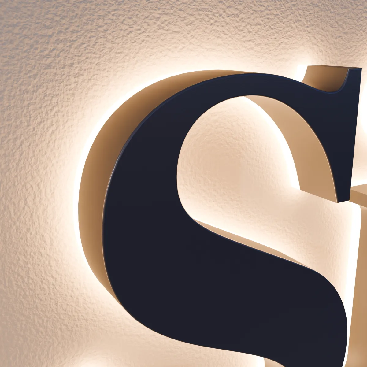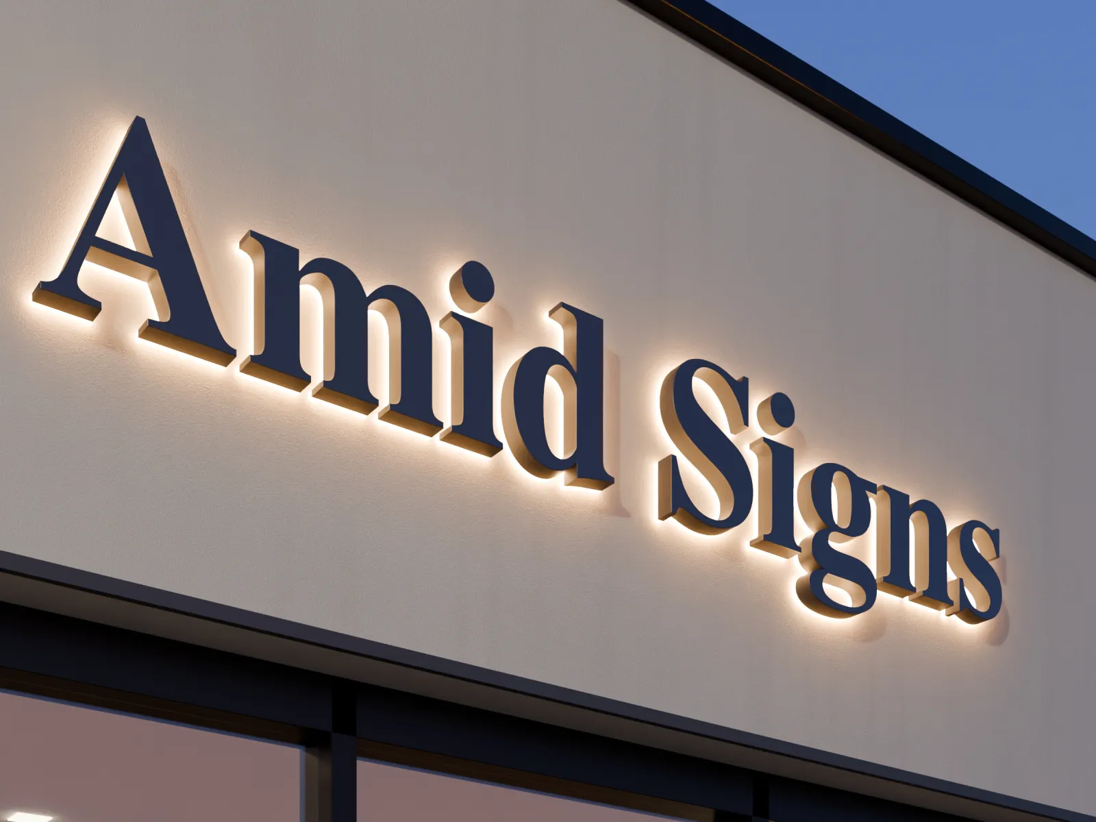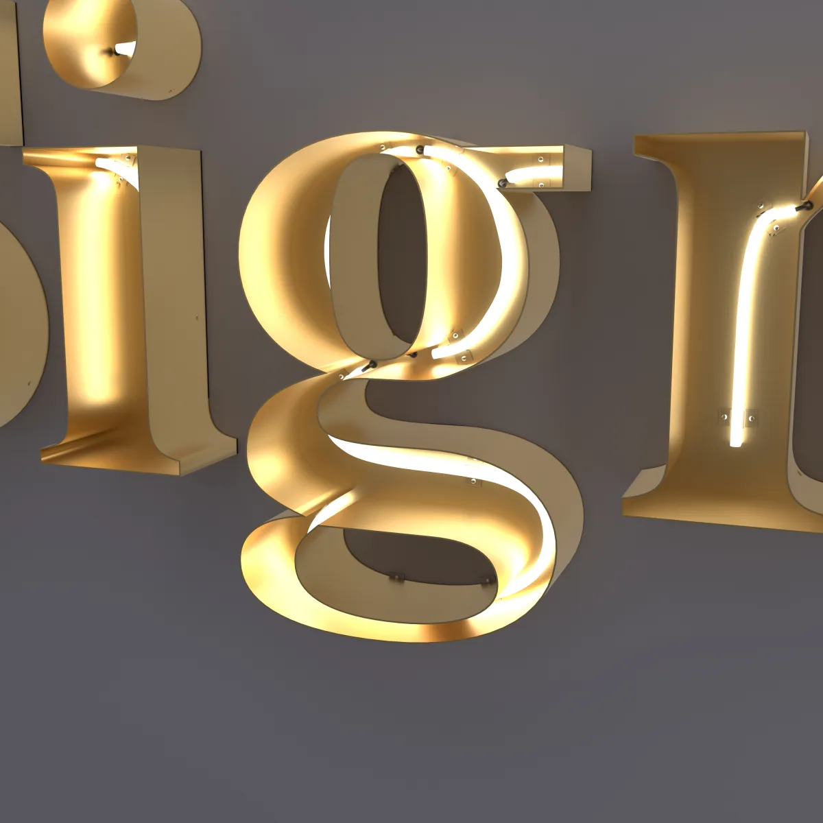
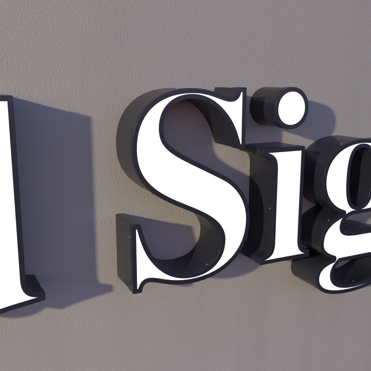
You don’t need a new logo to get channel letters. In most cases the sign is built from the font and logo you already use. But a font that looks great on a business card can behave differently when every letter is a steel shell with light inside, read from across a street.
This guide covers what to look at in a font, and what we check on your drawing before anything is made.
Why fonts change as channel letters
Three things happen when a font becomes a sign:
- Every letter is built. Each letter is cut and bent in 304 stainless steel, with its returns following the outline and LEDs inside. Fine details have to be big enough to make and to light.
- Distance shrinks details. A hairline you can read on a menu disappears from across a parking lot.
- Light changes shapes. At night, bright strokes can seem to spread into the open spaces of a letter. Highway sign researchers call this irradiation, and fonts with open, roomy shapes hold up better (Clearview research).
Stroke thickness
Medium to bold fonts with fairly even strokes are the easiest to turn into channel letters. There is room inside each stroke for light, the glow is even, and the shape of each letter reads from far away.
Watch out for:
- Very thin strokes. A hairline leaves little room inside for light and reads as a faint line from a distance.
- High contrast between thick and thin. Some elegant serif fonts pair heavy strokes with hairlines. As a sign, the heavy parts dominate and the thin parts fade.
- Very light or condensed weights. Lettering that looks refined in print can look weak on a wall.
A quick test: shrink your logo on screen until it is about the size of your thumbnail. If the thin parts disappear, they will look weak on the wall too.
Thin serifs and script details
Serif fonts work well as channel letters. The serifs are part of each letter’s outline, so the steel follows them. Very fine, pointed serifs may need to be a little thicker to be built, and your drawing shows it if they do.
Script fonts take more care:
- Joins. In a connected script, the strokes that join one letter to the next are often the thinnest part of the word. Your drawing shows how they are handled.
- Flourishes and swashes. Long, thin tails look great in print but add width and fine detail. Sometimes a shorter version reads better.
- Small extras. Dots, accents, tiny stars or a trademark symbol may be too small to build at your letter size.
A tagline set much smaller than the name is a common issue. It often reads better as its own, smaller line, or on the door or window instead.
Letter spacing
Tight spacing that looks sharp in print can make lit letters blur together from far away. A little more space between letters helps each one read on its own, especially at night.
Two practical points:
- Touching letters. If letters in your logo overlap or touch, they have to be joined into one piece or moved slightly apart. Your drawing shows which.
- Spacing changes the width. More space between letters makes the whole sign longer. Check it against your wall: see How to measure your wall for channel letters.
All caps or mixed case
Letter height on a sign is measured on the capital letters. In mixed case, most lowercase letters are shorter, so a font with tall lowercase letters looks bigger at the same height.
Mixed case is generally easier to read. The United States Sign Council finds that text in all capitals needs letters about 15% taller to be read from the same distance; our size guide covers this. Also allow room below the line for letters like g, j, p and y, which drop under the others.
If your brand is set in all caps, keep it: being recognized matters too. If you are choosing fresh, mixed case is the safer choice for a longer name.
How open-face neon follows the stroke
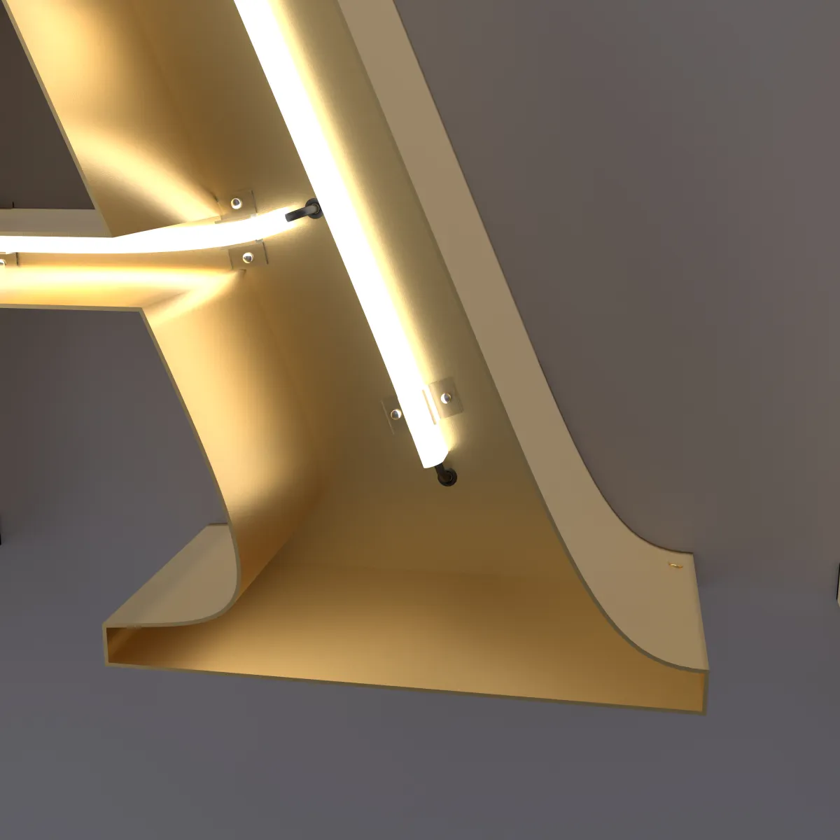
Open-face neon letters work differently from the other two styles. Each letter is an open steel channel, and a line of LED neon runs along the middle of each stroke, held by clips. So the skeleton of your font matters: every stroke becomes one line of light.
What that means for your font:
- Curves and corners. LED neon can only bend so tight; each product has a minimum bend radius, and bending past it can damage the neon (Ultra LEDs). Sharp corners and pointed ends get a small curve in the line of light.
- Where strokes meet. One line can’t split in two, so at the middle of an E or the cross of a t, the neon is laid in separate runs. Your drawing shows the path.
- Serifs and small spurs. These stay in the steel shape, while the neon follows the main strokes.
- Stroke width. Each stroke needs room for the neon with steel on both sides, so medium to bold weights suit this style best.
If you want the whole face of each letter to glow, front-lit letters follow the full outline of the font. If you want a soft glow around solid letters, see halo-lit.
Why we send a drawing first
Every order starts with a drawing you approve, and nothing is made until you say yes. For fonts, that drawing is where you see:
- Your letters at their real size on your wall
- A preview of the sign lit up
- Any change needed to build your font: a thicker hairline, a little more spacing, a simplified flourish, or the neon path in open-face letters
So you see every change before you pay, not after the sign arrives.
What to send
- Your logo, ideally as a vector file (AI, PDF, SVG or EPS). A JPG or a photo of your current sign is fine to start. See How to prepare your logo file.
- If the sign is just text: the exact wording, with capitals as you want them, and the font name if you know it.
- Your wall width and a photo, through the quote form.
Not sure which style suits your business? See signs by type of business, for example salons and barbershops or offices and lobbies, or start with Channel letters: the complete guide.