Your brand colors were probably chosen on a screen and defined for print. A sign is made of steel, acrylic and light. Getting close is very doable once you know which part of each letter carries which color, what codes to send, and where screens and real materials part ways.
For steel finishes and wall contrast in general, see Choosing colors and finishes for stainless steel letters. This guide is about matching a brand. Still choosing a lighting style? Channel letters: the complete guide compares all three.
Find your color codes
A brand guide usually lists each color several ways. Here’s what each code is, and how useful it is for a sign.
| Code | What it is | For a sign |
|---|---|---|
| Pantone (PMS) | A numbered color from a printed swatch book, such as "PMS 286 C" | The best single reference, because it's defined by a physical sample |
| CMYK | Ink percentages for printing | Useful for printed parts |
| RGB | Red, green and blue values for screens | A reference only |
| HEX | RGB written as a six-character code, such as #1F3A5F | A reference only |
Send every code you have, and say which color is the main one. A vector logo file usually carries color values inside it, but send the codes too: files are sometimes saved in a different color mode.
Which part carries which color
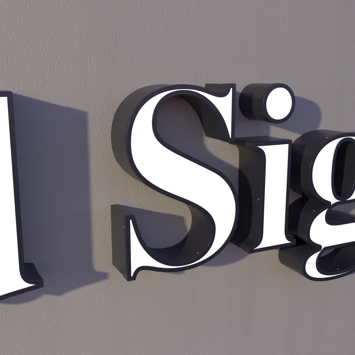
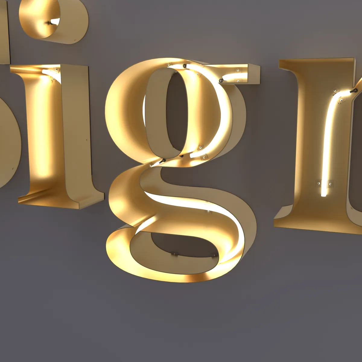
A channel letter has up to three places where color shows: the face, the returns (the sides) and the light. Which ones you can use depends on the style.
| Part | Front-lit | Halo-lit | Open-face neon |
|---|---|---|---|
| Face | Acrylic | Steel, printed with your artwork | None — the front is open |
| Returns | 304 stainless steel | 304 stainless steel | 304 stainless steel |
| Light | Glows through the face | Glows on the wall | The neon line |
| Brand color at night | The lit face | The shape and the halo | The neon line |
Every face color, steel finish and light color is chosen with you and shown on your drawing before you pay.
Front-lit faces
On front-lit letters, the face is the brand color day and night. Keep in mind:
- Lit and unlit look different. By day you see the acrylic in daylight; at night, lit from inside, the same face can look brighter and slightly different in tone.
- Dark colors glow less. A navy or deep green face lets less light through, so it looks dimmer at night. If your main color is very dark, consider putting it on the returns with a lighter face, or choosing halo-lit, where the face isn’t lit from inside.
Printed halo-lit faces
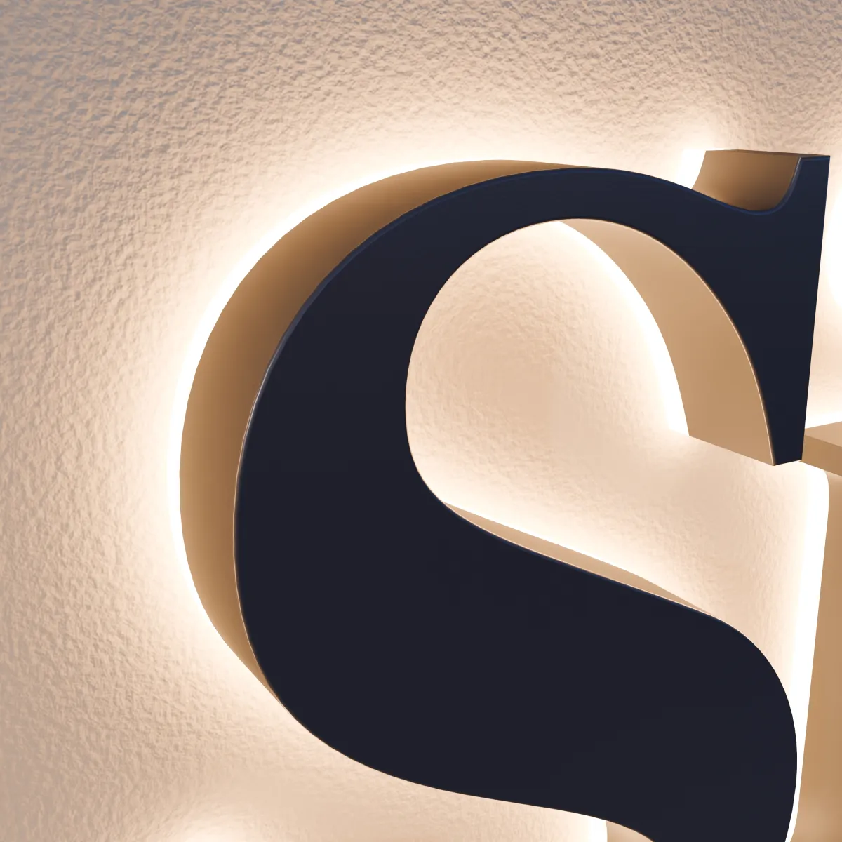
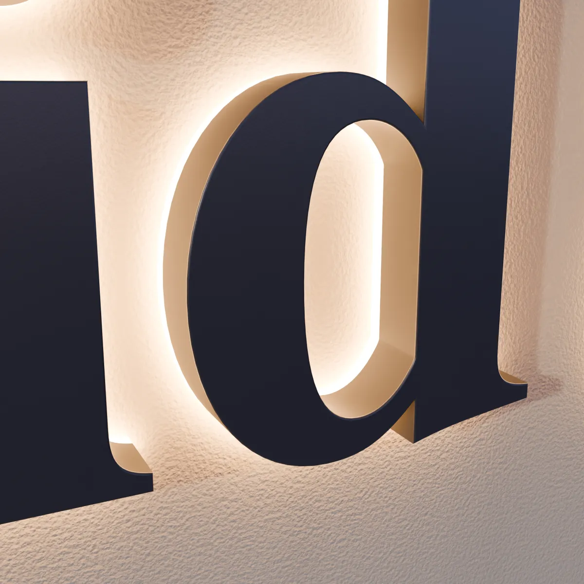
Halo-lit letters have solid steel faces printed with your artwork, so a logo with several colors keeps them. By day, people see your colors on the faces. At night the faces stay dark and the glow outlines each letter, so your brand reads through the shapes and the light color.
The wall is part of the result. The halo is light reflected off the wall, so a colored wall tints it, and a wall close to your face color makes the letters blend in by day. For a logo on a lobby wall, see Reception wall logo signs.
Return colors
The returns frame each letter. Three common approaches:
- Match the face so each letter reads as one solid shape.
- Contrast with the face — for example, dark returns around a light face — for a crisp outline.
- Use a second brand color where your brand has one.
We go over the finish for the returns with you, and it is shown on your drawing.
Light color
White light comes in warmer and cooler tones, usually described in kelvins (K): lower numbers look warmer and more yellow, higher numbers cooler and more blue. The light color changes how a face color looks at night, and how the halo looks on your wall. We choose the light color with you, and the lit preview on your drawing shows the effect.
On open-face neon letters, the neon line itself is your night-time color, and we confirm it with you on your drawing. By day, the steel finish carries the look.
Why the sign won’t look exactly like your screen
- Every screen is different. Screens make color from light, and the same file looks different on a phone, a laptop and a monitor.
- Materials depend on the light around them. Acrylic, painted steel and printed steel reflect light, so they shift between morning sun, overcast days and indoor lighting.
- Some screen colors are out of reach. Very bright, saturated colors — vivid greens, oranges and pinks especially — can look stronger on a screen than paint or ink can make them.
- Finish changes color. Gloss, matte and brushed surfaces reflect light differently, so the same color looks different on each.
So decide what matters most. Usually one color has to be right, and the others only need to be close.
How to check before you approve
Your drawing shows your colors on the letters and a preview of the sign lit up. That preview is on a screen too, so use it to judge placement, contrast and the overall look — not as an exact color proof.
If one color has to match exactly, say which one in the notes on the quote form, and ask us about it.
It also helps to point to something real you’re happy with, such as a printed menu or packaging. A daylight photo of it is a useful reference, but photos shift color too, so send the code with it.
What to send
On the quote form, include:
- Your logo file — see How to prepare your logo file
- Your color codes, Pantone first, with the main color marked
- Which part should carry which color — face, returns, light — or ask us to suggest
- A photo of the wall, so we can check contrast and the halo
- Any color rules from your landlord or city — see Sign permits: what to ask
Ordering for a storefront? The storefront sign checklist covers everything else to settle before you order.
We reply with a drawing in your colors, a lit preview and an exact price; pricing explains what sets it. Nothing is made until you approve.