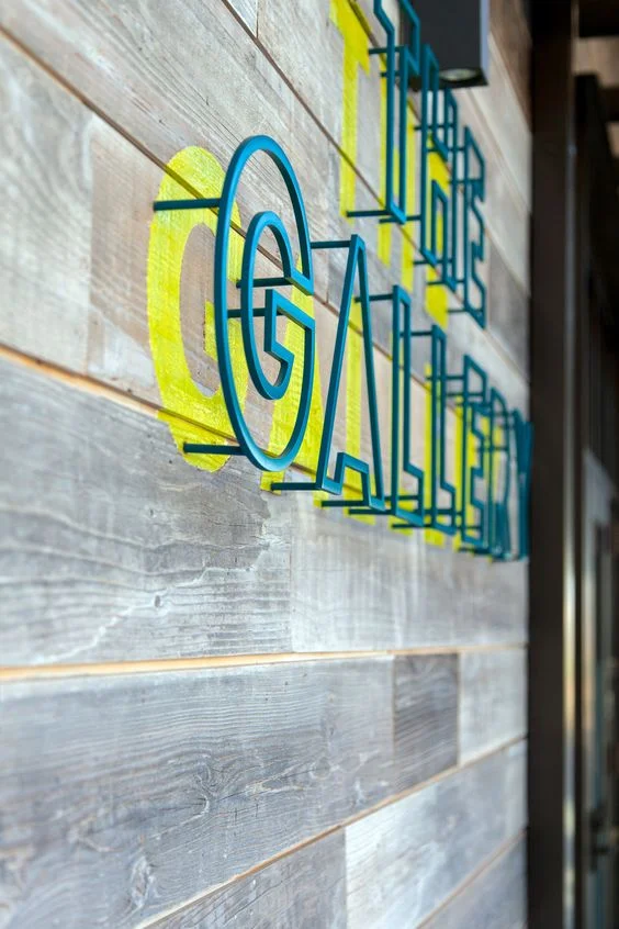
In the world of business signage, the right design can make all the difference. An exceptional sign not only grabs attention but also leaves a lasting impression, effectively communicating the brand’s identity and values. One such striking example is “THE GALLERY” sign, mounted on a wooden plank wall. Let’s delve into the elements that make this commercial sign a perfect blend of artistry and functionality.

A Blend of Rustic and Modern Aesthetics
The Background: Rustic Appeal
The 3D metal outline letter sign is mounted against a rustic, grayish wooden plank wall. This choice of background adds a touch of vintage charm and contrasts beautifully with the vibrant colors of the sign. The weathered texture of the wood evokes a sense of history and authenticity, making it an ideal backdrop for a business that values tradition and craftsmanship.
The Sign: A Modern Masterpiece
The letters of “THE GALLERY” are three-dimensional, providing a sense of depth and presence. Each letter is outlined in a vibrant blue metal, giving it a sleek, industrial feel. This modern material choice contrasts with the rustic wood, creating a visually captivating juxtaposition that draws the eye. The metal outline adds durability, ensuring the sign will withstand the elements while maintaining its bold appearance.
The Power of Color Contrast
Vibrant Blue Outline
The blue outline of the letters is not just about aesthetics; it also serves a functional purpose. The vibrant blue hue catches the eye from a distance, making the sign highly visible. This color choice is particularly effective in drawing attention and conveying a sense of professionalism and creativity, qualities that are essential for a gallery or any business looking to make a strong impression.
Bright Yellow Shadow
Adding to the visual impact is the bright yellow shadow behind each letter. This shadowing technique creates a striking contrast with the blue outline and the grayish wood background, making the letters pop. The yellow shadow adds a layer of dimensionality, enhancing the three-dimensional effect and making the sign even more eye-catching.
Perspective and Dimensionality
Side Perspective
The photo of “THE GALLERY” sign is taken from a side perspective, emphasizing the depth and dimensionality of the letters. This angle showcases the three-dimensional nature of the sign, highlighting how the letters stand out from the wall. The side view also accentuates the interplay between the vibrant blue outline and the bright yellow shadow, demonstrating how these elements work together to create a dynamic and engaging visual effect.
Three-Dimensional Letters
The three-dimensional design of the letters is a testament to the craftsmanship involved in creating this sign. The depth of the letters adds a tangible quality to the sign, making it not just a flat display but a piece of art in its own right. This dimensionality ensures that the sign captures attention from multiple angles, enhancing its visibility and impact.
“The Gallery” sign is a prime example of how effective design can elevate a business’s presence. By combining rustic and modern elements, leveraging bold colors, and emphasizing dimensionality, this sign captures attention and communicates a sense of quality and creativity. Whether you’re looking to enhance your business’s exterior with commercial signs, event backdrops, or wedding backdrops, the principles demonstrated in “THE GALLERY” sign can serve as a guide to creating an impactful and memorable display.
[blocksy-content-block id="10807"]